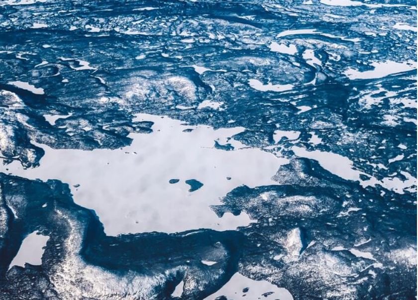
A research ship is dragging a sound pulse across the water somewhere off the coast of Alaska that no one has ever properly listened to. The pulse exits the hull, descends into the darkness, bounces off a trench, a ridge, or an unidentified valley, and then reappears as a number. One figure, then another. Every day, thousands of them. That is how the ocean floor is drawn—slowly, in pings, by individuals that the majority of Americans have never heard of.
It’s odd to acknowledge that a nation that claimed to have the best maps in the world for more than a century has never actually completed mapping itself. Less than 25% of the seafloor inside U.S. waters has been surveyed to a resolution that truly shows you what’s down there, depending on how you count it. On a generous reading, NOAA places the higher-resolution figure at about 50%, but scientists who work with the data usually shudder at that figure. The majority of what has been “mapped” is hazy, with estimates derived from satellites missing anything smaller than a tiny mountain.
Speaking with professionals in the field gives the impression that this disparity has been embarrassing for a very long time. The total area of all fifty states, the territories, and the District of Columbia is smaller than the U.S. seafloor. However, for decades, the nation’s scientific and strategic focus has shifted upward, toward Mars, orbiting satellites, and photogenic atmospheres. In the meantime, the Pacific floor has been left to ancient British soundings, some of which were taken in fathoms and some of which are still used in contemporary charts nearly a century after they were first collected.
At last, that is starting to change. High-resolution multibeam surveys have been pushed into areas of the Pacific and the Gulf of Alaska that have been unexplored for many years by NOAA Ocean Exploration. Earlier this year, the Scripps Institution of Oceanography received about fifteen million dollars in federal funding for what its researchers have discreetly called the most ambitious deep-sea push in a generation. In order to turn curiosity into funding, nonprofits like Map the Gaps have been cutting the ocean into hexagon-shaped tiles and asking regular people to “adopt” them. Depending on the day, it can be charming or a little desperate. Maybe both.
Curiosity isn’t what’s actually causing the urgency. Nearly all of the world’s data traffic is now carried by underwater cables. The fragility of that infrastructure has been painfully exposed by recent events in the Taiwan Strait and the Baltic. Knowing the floor’s shape beneath the wave is essential to tsunami warning systems. This also applies to the still-contentious deep-sea mining industry, which continues regardless of the completion of the maps.
The global effort to map the entire ocean by the end of the decade, known as Seabed 2030, has now surpassed 28%. This represents an increase from 6% in 2017. It is another matter entirely whether the United States achieves its portion of that goal. The Pacific is vast, ships malfunction, and federal budgets fluctuate.
Even so, it’s difficult to ignore the fact that something has changed as you watch the data come in, hard drive by hard drive, ping by ping. The nation has been looking up for a long time. Finally, it has begun to look down in silence.